- Home
- / Blog
- / Art History
The Calm and the Abyss: Meaning of the Color Blue in Art
10/26/2021

Introspective, deep, with an immediate calming effect: blue is as soulful as the sea, as peaceful as clear skies. Not surprisingly, many people's favorite colors include different shades of blue, and this hue is extremely popular among cool colors in contemporary aesthetic choices -from design to architecture, and from fashion to marketing. This preference for the color blue, particularly deep blue, is undoubtedly due to its relaxing perception and how this meaningful color is encoded by our cognitive system, calming eyes, and brain.
Blue pigment and also blue light encourage rest and a meditative attitude. They communicate safety and peace. It is no coincidence that the color blue was chosen by Mark Zuckerberg for the iconic Facebook logo, for the night lights on airliners, and also for the corridors of numerous hospitals. Blue, with its cooling effect, helps to reduce anxiety and mental tension, to physically slow our heartbeat, and, finally, breathe.

However, as we have already addressed in other articles that dealt with the use of colors in art -black and white, red, yellow- the meaning of the color blue is not the same universally. The symbolism of colors is relative, it is a cultural fact subject to historical eras. Of course, blue is on a perceptual level a soothing color, but its flat calm can also communicate a sense of melancholy. Blue is also associated with mourning and depression: the ‘blue Monday’, which conventionally falls on the third Monday of January, was identified in 2004 by psychologist Cliff Arnall as the saddest day of the year. Since the 14th century we have used idiomatic expressions such as ‘feeling blue’, ‘blue funk’, ‘having the blues’, all using the color blue to indicate states of sadness. Yes, even the color theory depends on our culture and perception and the symbolism of blue is also a social construct. Colors have shades of meaning… as lights and shadows, they can express a concept and parallelly the exact opposite.

Blue's emotional polarity makes it popular and fascinating. However, it has not always been this way. It may sound absurd, but the history of blue is a relatively recent invention! Although it is a primary color, it has not always existed as we understand it today in the color spectrum. For example, there is no trace of blue paint in cave paintings, and no mention of the word ‘blue’ in the ancient Greek texts. Not even in the Odyssey of Homer, which must have been well aware of the dark blue of its Mediterranean sea. There are even cultures, such as Namibians, where there are no separate terms for the blue and secondary color green. The reason for this scarcity of early blue representations is to be found in nature. Blue is associated with the sky and the sea, but not always. In truth, the blue color is quite rare in nature, too. Flowers, animals, minerals, and blue eyes do exist, but they are uncommon. They are rare and therefore extremely precious.
Blue Pigments and Their Deep Shades

One of these treasured blue gemstones let the story of the blue pigment and blue in the art begin. The Egyptian blue, one of the earliest pigments, derived from the lapis lazuli, mined almost exclusively in Afghanistan and very expensive in Ancient Egypt. The Egyptians, as they did with other pigments, mixed this mineral with other substances to make Egyptian blue dyes that only pharaohs and royalty could afford. Bright and prized, blue artworks and blue paintings realized with this pigment were rare. Ultramarine blue was also derived from lapis lazuli until the 19th century. This deep blue pigment owes its name to the distant and exotic origins of the mineral: ‘ultra’ from the Latin ‘beyond’, and ‘marine’ from 'mare’, sea. Starting from 1826 a synthetic and cheaper version of ultramarine blue was invented in France by the chemist Jean-Baptiste Guimet. It was called French ultramarine, and it was similar in every way to the original mineral pigment. Cobalt blue was also one of the most precious and desirable shades in the painters' palette as it was incredibly stable. It was also discovered in the early 19th century, although an enameled version, ‘smalt’, of cobalt blue was already known in the Middle Ages. Darker than cobalt blue is Prussian blue, also known as Berlin blue. Prussian blue was always made chemically, as a result of the oxidation of ferrous substances.
Therefore, being a pigment not so abundant in nature, the blue color has been considered rare and mythical for centuries. The meaning of blue color is inextricably intertwined with its preciousness. Once again, art history comes to our aid in understanding how the symbolism of blue has changed over the centuries. In this article, we will explore 5 different ways in which blue has been used by artists. The history of blue is also the history of famous blue paintings, and how they embody their calm and their abysses.

5. Blue as a Precious Fabric
Colors have always expressed meanings and values even through fashion and clothes. For example, there was a time when blue was not the quintessential masculine color and pink the feminine one. The arbitrary idea of distinguishing clothes based on gender came during the post-World War II boom, mainly for marketing reasons. However, the history of painting shows us how blue was historically used primarily in women's clothing. In particular, blue was also important for Christian iconology, being the favorite color in depicting the Virgin Mary's mantle. Precisely because it was considered a precious, serene, and innocent color. Pink, on the other hand, was conceived as a strong and masculine shade of red. As can be seen well in Antonello da Messina's Annunciate, blue was an expensive pigment in Renaissance Europe, and for this reason was reserved only for holy figures.

Another example of precious fabric and blue paint is hidden in a famous artwork by Jan Vermeer, the Girl with a Pearl Earring is wearing a turban realized with Ultramarine blue. A detailed study conducted by scholars showed that the Dutch painter Vermeer used an intense and expensive Ultramarine Blue, which also enhanced the price of this eternal piece of art.

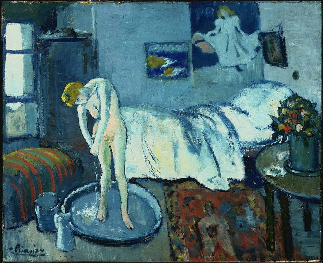
4. Blue like Picasso’s Sadness
Pablo Picasso was not always throughout his long life the successful artist we all know today. At the beginning of the 20th century, the painter went through years of economic uncertainty, instability, and little artistic recognition. Picasso's blue period paintings correspond to this difficult period. They were made between 1900 and 1904, the year he moved from Spain to Paris. Popular today, these blue paintings actually have somber tones and subjects. The subjects were beggars, circus workers, street children, and desperate people. Picasso through the blue color captures their desolation, their conditions of society outsider to which himself was akin.
3. Blue as a Monochrome Painting
Not everyone knows that the acronym IKB 79 refers to a particular shade of blue but, above all, to the story of the French post-war artist Yves Klein. The International Klein Blue (IKB) is a designated hue of pure ultramarine blue that Klein registered in 1957 as his trademark. Sold as acrylic paint to celebrate the 90th anniversary of the artist's birth, Klein used this specific blue for his most iconic monochromatic paintings and more. The rejection of figurative art drove the painter to the monochrome style, and the need to create artworks without boundaries. His blue canvases then became an attempt to convey pure color, like an immaterial and unmeasurable window. Its International Klein Blue was unrelated to its function, and its sale makes it, as Duchamp did first and then his colleague Piero Manzoni, an artistic practice between mysticism, provocation, and marketing stunt.
Today, kleinish blue paintings are part of the most famous museum collections in the world, from MoMA to Tate Modern. And this particular blue is inextricably linked, rightly or wrongly, to the name of the artist.

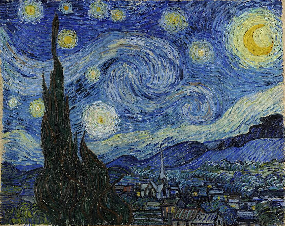
2. Blue as a Night Sky
Among the most famous blue paintings in art history is undoubtedly Van Gogh's Starry Night. In this painting the blue is the master, giving back a hallucinated, swirling, and distorted night sky. The painter completed the masterpiece just before being hospitalized at Saint-Rémy de Provence when his mental illness became more and more severe. The hallucinatory episodes and the fear for the uncertain future were transposed on the canvas, showing the gloomy atmosphere in which Vincent felt he was living.
The choice of blue has an emotional value. The painter declared to his brother Théo that he used cobalt blue as 'a divine color and there is nothing so beautiful for putting atmosphere around things’. However, according to a recent analysis, Van Gogh used numerous types of blue to achieve the iconic effect. You can count at least 21 blue pigments in the artwork!
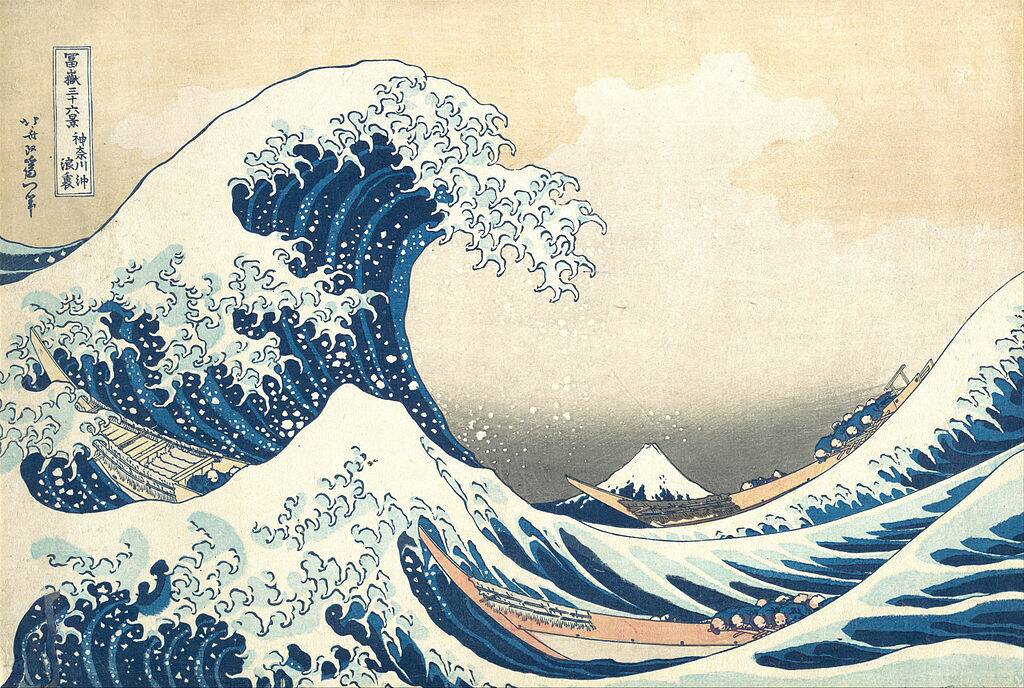
1. Blue like Sea Waves
Many artists have used blue pigments to depict the sky, but perhaps, even more, have devoted themselves to the power of the sea. However, just as there are different types of blue, different types of seas and oceans have also inspired artists. The sea can be as dangerous, as untamed, as rabid as that of the Great Wave by Katsushika Hokusai. Realized in 1831, this iconic painting has made Japanese art famous throughout the world. Hokusai depicted with dark blue the unpredictable strength of the sea, showing a wave that looks taller than Mount Fuji in the background.
The Japanese inspiration also influenced the Impressionist movement. And what blue seas appear more different in representation and coloring than those depicted by Monet? In Shadows on the Sea. The Cliffs at Pourville, Monet used touches of indigo blue, almost violet-blue. His sea returns to the initial meaning of blue: it expresses calm, placidity, blending with the indigo sky.
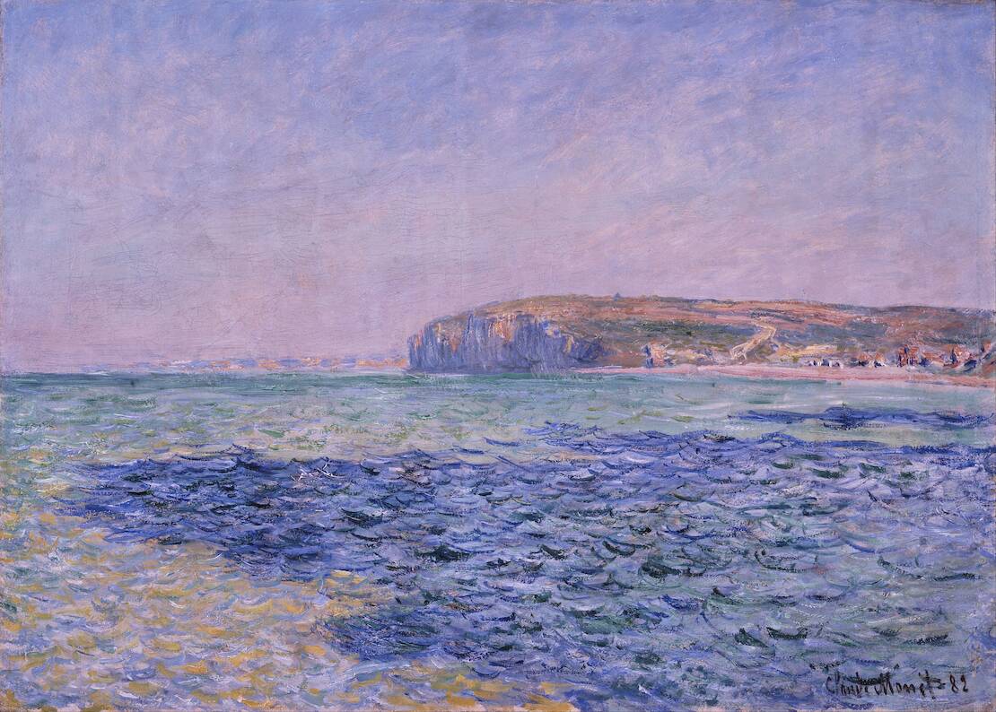
Claude Monet, Shadows on the Sea. The Cliffs at Pourville, 1882, via Wikimedia Commons.
However, there are also non-literal representations of the sea. 32 mq di mare ca (32 square meters of sea ca) by Pino Pascali, exponent of the Scuola di Piazza del Popolo in the 60s in Rome, is a complex work but elementary at the same time. Pascali fills tanks with diluted blue pigment, making them a modular, geometric metaphor for the sea. The sea is playfully and surreally boxed in. Artificial elements such as synthetic colors are mixed with natural elements. They tell in a minimalist way the relationship with nature and in particular with the sea, symbolic father of the artist born in Apulia. The blue is an intense and deep expansion that induces reflection, meditation, and a confrontation with inner life. Blue is a pure and deep color, once again bearer of unspeakable mysteries.
___________________________________________________________________________________________________

Cinzia Franceschini is an Italian Art Historian specialized in History of Art Criticism, with a second degree in Communication and Sociology. She studied in Padua, Brussels, Turin and wherever you can go with the power of the Internet. She works as guide in Museum Education Departments and as a freelance writer. She writes about Contemporary Arts and Social Sciences, mostly about them at the same time, in an inclusive, feminist, transnational perspective.

_-_Galleria_Regionale_della_Sicilia,_Palermo.jpg)
,_1960.jpg)