- Home
- / Blog
- / Art History
Purple Color in Art: Creativity's Spiritual Color
11/04/2021

Imagine a beam of purple light. When light passes through a prism, purple is among the most refracted colors of the visible spectrum. Purple color is difficult to distinguish by the human eye and its different shades vary according to everyone's perception. It is not only the hardest to recognize hue of the color palette, it is also among the rarest colors in nature. Could this elusiveness to the human gaze be the actual reason for purple’s innate mystery? A color we know exists yet struggle so much to discern, immersed in ambiguity. When we think of purple, in fact, the feeling of mystique, intuition, spirituality, and magic immediately pervades us.
In many cultures, the purple color is associated with the unknown. It connects to the world of imagination and spirit. It is a color that evokes meditation and wisdom, that leads away from the burdens of material life. It seems to perfectly embody its chromatic origin: a colorful combination of the introspection of blue and the energy of red. Purple is the secondary color of that mixed reflection and action, inwardness and outward. It represents full creativity, at its highest potential. Different shades of purple can simultaneously calm or stimulate the viewer. It can give serenity like a lavender field or be dark and meditative like cobalt violet.

The history of purple dye, like that of other pigments, is also rooted in mystery. The pigment was first created in the Phoenician trading town of Tyre, now in Lebanon, which is why it was named Tyrian Purple. However, the origin of the precious dye surprises us today: the Tyrian color was made by extracting a special secretion from snails, boiled for a long time in lead vats. It was a long and difficult manufacturing technique to produce in large quantities; for this reason, Tyrian purple was considered extremely prized and only nobles could afford to use it for their robes.
Centuries had to pass before a cheaper and easier purple paint than Tyrian color was obtained. And again, the discovery was curious and accidental. In the 19th century, the young English chemist Henry William Perkin, then only eighteen years old, discovered synthetic violet. But he discovered it while he was experimenting with an anti-malaria treatment, then extremely widespread in South Africa and problematic for the British Empire’s attempts of colonization. During these experiments, Perkin obtained a surprising substance, with shades that mixed a dark almost black color, ultramarine blue, and warmer colors. He discovered deep purple, which he called aniline purple and later 'mauve'. He patented this synthetic dye, which enabled the spread of the pigment to the art world and the creation of incredible purple paintings.

Purple pigment, via Unsplash.
Purple color, with its different shades, is currently popular, and a lot. In 2018, ultraviolet was decreed the Pantone Color of the Year. It has broken free from its original symbolism of royalty and elitism, to become on the contrary the color of unconventionality and creative brilliance. It was used by the Women's Suffrage movement, during the battles for voting rights; it became popular and rebellious in the 1970s musical eccentric icons such as Prince, Jimi Hendrix, and David Bowie. Its ambiguous color combination makes it fluid and imaginative. Not surprisingly, it is often associated with magic. Just think of the robe of the mythical wizard Merlin, with its purple fabric.
Wisdom, enchantment, mystery, and meditation. Purple with these deep features has also seduced artists of every age. In this article, as we have already succeeded with the other in-depth studies about the color palette - black and white, red, yellow, blue, and shadows- we will dive into this imaginative purple haze. We will grasp the vibrant spirit that this color has given to the purple art of 5 exemplary artists. Try not to become obsessed with violettomania, as happened to Claude Monet. Let us limit ourselves, where possible, to perceive the spiritual fulfillment of this magic color.
1. As Regal As a Purple Cloth
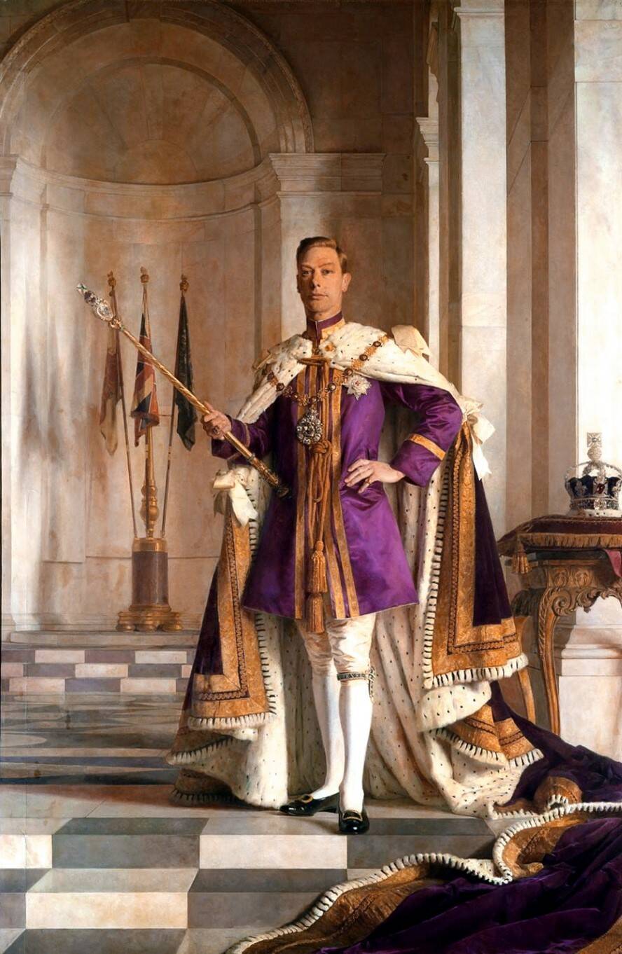
The color purple was long perceived as symbol of royalty and wealth, even today its sophistication is recognized. The reason is to be found in that mysterious and precious dye, obtained from snails: the ancient Tyrian color. Considering its high price, purple dye was used only by the wealthiest classes, even imperial ones. It was so that Romans, Egyptians, Persians began to show reverence towards a color that even seemed to belong only to the gods. Historical figures such as Alexander the Great, the Byzantine emperor Justinian I, wore purple clothes to exalt their rank. The idiomatic expression born in the purple indicated to the Byzantines the royal membership since the empress used to give birth to the heirs in the Purple Chamber.
Purple color in art was therefore long used in the iconography of nobles and royalty, as evidenced by the many official portraits of George VI made in the 20th century. The tradition of purple, in fact, has not been forgotten in modern times. Even Queen Elizabeth II was seen in purple in 1953 at the moment after her coronation. Colors always have deep meanings, rooted both in our individual perception but also radiated in society. No chromatic choice is ever casual.
2. The Impressionist Violettomania
“Fresh air is violet”, Claude Monet wrote in his notes at the end of the 19th century. What did the great Impressionist painter mean by these words? It is certainly a poetic and evocative quote but knowing Monet's analytical eye there is much more than that. It better refers to his meticulous studies to represent nature and atmospheric effects.
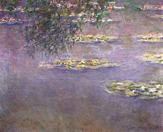
According to Monet, fresh air becomes violet because purple paint allowed him to reach the indistinct color of the atmosphere. “I finally discovered the true color of the atmosphere”, he once said, “it is purple!”. Furthermore, the artist, like all Impressionists, studied the variations of light and shadows. Violet, with its muted shades, its fuzzy quality, helped him to create more realistic shadows. It was a revolution in his paintings, compared to shadows made through black pigments. This explains why the shades of purple often recur in Monet's paintings, as if they were covered by a violet patina. However, it is not the only reason.

The frequent use of purple in Monet’s purple artwork has technical reasons, but also biographical. The enthusiasm for purple soon infected the other Impressionists, so that the art critic Oskar Reutersward in the 1950s, spoke of real violettomania among the innovative group. With this expression, the theorist wanted to draw attention to the impressionists' exaggerated use of synthetic blues, purples, pinks, plum colored art. The use was so obsessive that some accused the painters of hysteria. However, Monet's overwhelming love for this tonality could also have physiological reasons. The painter suffered, in fact, in the course of his life of cataracts, an eye disease that prevented him from seeing colors in a defined and brilliant way. After numerous operations, the artist was able to recover part of his sight but also a marked sensitivity to ultraviolet rays. This particular condition certainly had an impact on the purple paintings, which remain among the most intriguing of Monet's artistic production. Like a door that opens on oneiric landscapes, wrapped in a violet mist.
3. The Elegance of Klimt's Violet Lady
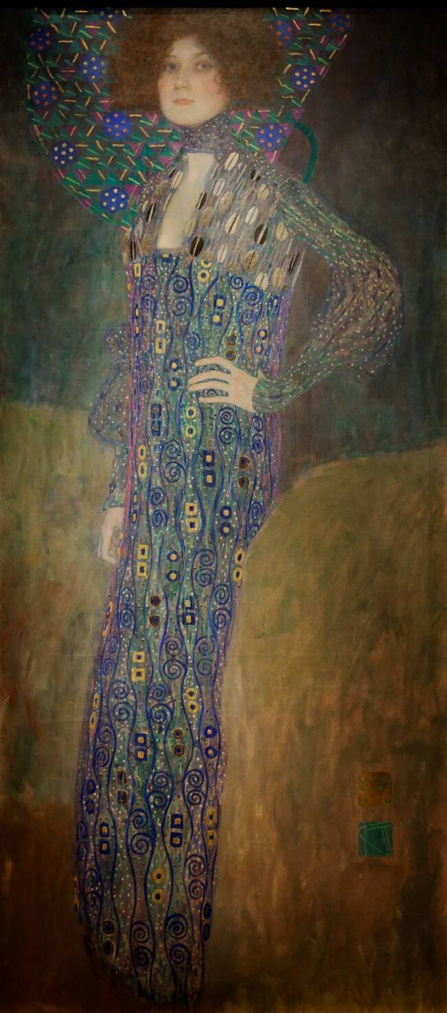
Among the ladies portrayed by Klimt, embellished with gold leaf decorations, like pieces of a precious fin de siècle mosaic, there is a purple one. The portrait of Emilie Louise Flöge stands out for the sinuosity of her pose, the elegance of her gestures, and her incredible dress, a masterpiece of purple art.
Many critics took it for granted that this was one of the many lovers of the Viennese painter, but the identity of the woman and the choice of color suggest something else, a relationship perhaps even more complex and spiritual. Emilie was the sister of Klimt's brother's wife, a young woman of excellent social standing to whom the painter acted as a foster uncle. In their dense correspondence, there is no trace of a love relationship; Klimt's sexual affairs were usually models and charwomen. Emilie Flöge, young and rich, according to the customs of the time, could represent a Platonic muse for Klimt. A sort of sacred icon, that the artist painted bejeweled and flamboyant, so much so that the Flöge family rejected the painting and sold it, offended by ostentation, to the city of Vienna. The purple color of her rich dress could evoke precisely the spiritual relationship that existed between Gustav and Emilie. A magnetic connection that moved on the edge of ambiguity.
4. Purple Abstract Paintings in Rothko’s Chapel
There is perhaps no painter who immersed himself more in the domain of spirituality and colors than Mark Rothko. In particular, his Chapel is a triumph of chromatic, religious, meditative stimuli. Conceived by critics as a sort of testament of the painter of color. It is not surprising that the artist chose different shades of purple for his greatest work. Rothko covered the walls of the small chapel in Houston (Texas) with maroon, plum, purple canvases.
Without too many words, he let the violet palette act on the eyes and minds of the spectators. The result is a deep, spiritual resonance that benefits from the religious setting. The Latvian-born American abstract painter was not a religious man, yet something mystical always resonates in his works. His violet chapel looks like a sanctuary dedicated to any faith and at the same time devoted to none. A place open to thought and meditation, where basic human emotions can spontaneously flow together, helped by the spiritual depth of purple color.
5. The Ultraviolet Rays of Dan Flavin
The same effect that Mark Rothko manages to achieve with purple paint, Dan Flavin obtains by sculpting the light. We have already immersed ourselves in Flavin's iridescent environments.
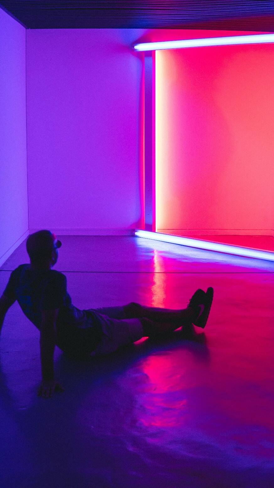
The minimalist artist is also used to harness the power of ultraviolet neon to create spaces with translucent violet reverb. The walls, glowing, almost seem to be painted in purple paint. The effect of this bath of light that strikes the retina directly can be hallucinatory, but in the case of purple, it can also be calming and relaxing. The experience of artificial immersion makes any space designed by Flavin unique. You have just to sit down and relax.
Today, purple is more popular than ever thanks to its integration into the cyberpunk and retro-futuristic genres. The neon shade of this color has become a staple in many people's everyday life with their use on purple wallpapers for both desktops as well as laptops alike; it can also be seen throughout modern video games where developers are using various shades from purples ranging all across the cyber worlds. It's not just because it reminds about the '80s, but also because purple offers a degree of coolness that other bright colors can't match. Neon lights are now all the rage thanks in part to this new trend and people love how they make their machines look futuristic while still being practical - what more could you want from your PC or laptop?
Conclusion
Purple is one of the most difficult colors to see and it has a mystical, spiritual quality. The purple color can be captured in art but not easily with paint because there are so many shades depending on how people perceive it. In art and especially in architecture, you should use light wisely for this same reason as well as create an environment that evokes feelings of spirituality and intuition.
_______________________________________________________________________________________________

Cinzia Franceschini is an Italian Art Historian specialized in History of Art Criticism, with a second degree in Communication and Sociology. She studied in Padua, Brussels, Turin and wherever you can go with the power of the Internet. She works as guide in Museum Education Departments and as a freelance writer. She writes about Contemporary Arts and Social Sciences, mostly about them at the same time, in an inclusive, feminist, transnational perspective.
