- Home
- / Blog
- / Art History
Absence of Colors: Three Symbolic Examples of Black and White Artworks
06/01/2021

‘What is your favorite color?’, we asked each other as children, and why not, we would also ask ourselves as adults. Choosing colors, appreciating and combining them, are actions that, knowingly or automatically, we carry out every day, often guided by our taste, the mood of the day, or even by introjected aesthetic rules. Colors are extremely important in giving the desired atmosphere to an environment, in communicating something through our clothing, in describing the personality of an object or a brand in an advertisement...and this is because any color hides, in its shades, a pregnant symbolic meaning that speaks directly to the most intuitive part of human beings. Different colors communicate different meanings. Red, yellow, blue, and all of them are imbued with culture and symbols. This is the first of a series of articles exploring this perspective.

However, color meaning and color associations are even more pounding thoughts for those involved in art, especially in painting. The artists of all ages have wondered about how to create the perfect pigment, how to make it shine or fade, which chromatic relations to favor to obtain a dramatic effect, to soothe, or to evoke primal emotional response. Warm colors or cool colors give different inputs and create different effects, but an analytical color theory is also added to color psychology. The color theory provides guidelines and key concepts that can help artists and creatives to choose colors and combinations in their artwork, it helps to reflect on primary colors, secondary colors, and complementary ones to create harmony, on different degrees of temperature to obtain different sensations.
It is not surprising that great artists like Picasso have an artistic production that can be divided into phases dictated precisely by the shades, almost monochromatic, he privileged -think about his famous blue or pink period. And this tendency does not concern only painting! Light installations such as those by Dan Flavin or Olafur Eliasson create extremely specific monochromatic ambiances, imbuing the environment with mono-frequency lamps.
Colors communicate, on a visual and cognitive level and a psychological one, but they are also linked to particular symbols and codified iconographies, especially in religious subjects. For example, in some cases traditional colors allow us to recognize saints or particular characters in ancient paintings -it is the blue color that always distinguishes the mantle of the Madonna! -, or, as in the case of liturgical colors used for sacred vestments, they mark different stages of the Christian calendar. Colors, like what happens with light, can always convey a religious and hidden meaning.

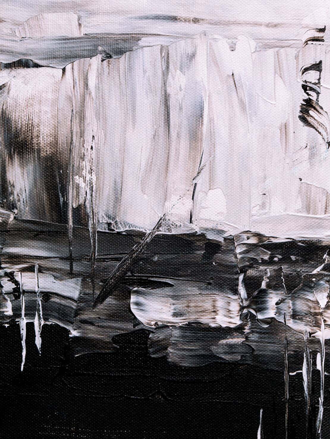
However, in this article, we want to radically reverse the perspective. Colors are important in art, design, architecture, and life... but what if we try to reason without them? Focusing on the absence of colors. We can speak of darkness without light (as we have done about shadow symbolism and cultural significance, but we can also speak of color, just observing black and white paintings.
The influence that black and white have on a subconscious level is extraordinarily strong: what is empty, what is full? What does communicate heaviness, authority, and what lightness and purity? Artists are well aware of the power of these two non-colors, both in their totality and in their absence.
In this article, we will explore three cases in which black and white are the undisputed protagonists of works of art, trying to grasp their symbolism. In a world built on color and increasingly simplified, black and white embody the relevance of complexity and duality. They challenge the visual references of our reality, giving us an aesthetic that is anything but empty.
A Black and White Square: the ‘Zero Degree’ of Painting
The color black is the first pigment used by human beings and artists in Prehistory, made from a mixture of charcoal and iron; it was the beginning, but it also symbolically represented the end.
Of course, it is a visually striking color, but already from the word it is easy to discover something more about its symbolic meaning. In Latin, the word black was ater, the etymological root of terms like atrocious or atrocity. In fact, it already implied all the negative moral qualities often associated with this intense color. Numerous cultures associate black with death, mourning, darkness, and the artistic iconography itself used it to represent the devil, especially in medieval paintings.
But black is also much more than this! Appreciated for its mysterious and elegant qualities, it is thanks to black and white abstract painting that it has also taken on more conceptual meaning.
The most striking and emblematic case is that of the Russian Kazimir Malevich, who in 1915 painted a black square on a white background. Simple, paradoxical, but at the same time radical. Who knows how many viewers were peeved, looking at it, how many will have wondered if the artist was serious about hanging this black square in an exhibition? Malevich used black color and geometry to bring attention to the zero degrees of painting. His painting technique pointed out that there was no longer interest in external reality or figuration, but only in sensitivity and spiritual meaning. The color was no longer the medium for understanding an artwork, but it became the expression of a surface in which visible and invisible coexisted.
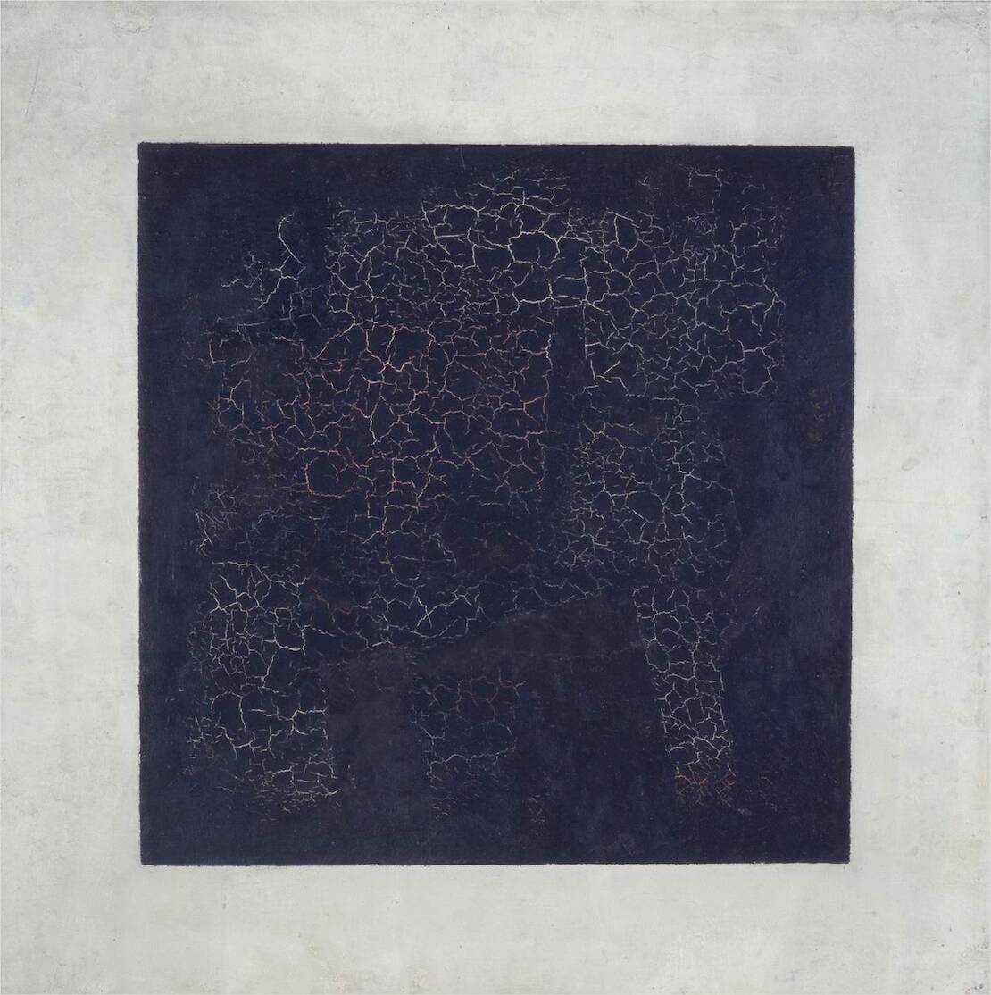
We must not confuse this iconic Malevich’s Black Square, but also the equally famous White on White square, with an attempt to obtain a cold and rational black or white painting. The Russian painter lets you glimpse the touches of his brush, his craftsmanship, his human presence. The black square is a nihilistic icon that resets art as it was known before, but at the same time, it wants to start from there, with a new vision. Famous American Minimalists, like Frank Stella, Ad Reinhardt but also other black and white and monochrome abstract art masters like Joseph Albers, Cy Twombly, Robert Rauschenberg’s White Paintings, cannot ignore this first revolutionary example. What you see is exactly what you see with the use of black and white painting, but we must not forget that even black and white are never truly neutral colors; they are not a pure thing, but always painted and connoted in some way through the lens of humans and artists.

The Incredible Story of Anish Kapoor’s Vantablack
You know, contemporary art is full of contradictions, controversies, provocations, and stories that sometimes stretch the limits of believability. That of the Vantablack and its owner, the contemporary British Indian artist Anish Kapoor, is one of them and it precisely concerns the color black. But not just any black, the blackest black of the world!
Everything happened in 2014 when the English company Surrey NanoSystems produced a black pigment called Vantablack, promoted as the darkest black ever created, Vantablack absorbed 99.965% of visible light. It was initially conceived for engineering purposes, but Kapoor soon grasped its potential in the visual arts, deciding not only to use it in his installations but also to ask the corporate for its exclusive rights. In summary, no artist could have made use of this incredible and ultra-mat shade of black and only Kapoor can exploit its aesthetic qualities - flat, visceral, dramatic, it seems the exemplification of a black hole or the great void.
The significance of this controversial gesture has other examples in the history of contemporary arts, starting with the famous blue patented by Yves Klein, but at the same time, it left the other colleagues of the art domain shocked. One in particular: the British artist Stuart Semple, to defiance of the exclusivity of Vantablack, has decided to develop an equally special pigment: the ‘pinkest pink’. Available to everyone on the market ... except for Anish Kapoor!

3. Black, White and Grayscale Artworks
We analyzed specific black or white iconic paintings, but we did not raise the issue of black and white and grayscale techniques yet. Why should artists choose to eliminate colors from the palette of their works of art? And why is the use of black and white so fascinating and symbolic?
The monochrome grey technique has ancient roots; the use of grisaille paintings was already frequent in the Middle Ages, especially in religious paintings, with the aim of not distracting the attention of the devotees from the godly subject using bright, captivating colors. In this way, black and white were interpreted as neutral and rigorous colors, already associated with spiritual symbolism. Subsequently, black and white paintings became a useful choice to better study the pictorial composition: the arrangement and intensity of shadows, lights, and chiaroscuro, black and white art was frequently used in painting but also photography.
It is in fact with the advent of photography that black and white has taken on an extraordinarily strong meaning.
The technique of monochrome photography is considered one of the most interpretive and accurate, and it was also important for contemporary arts.
Andy Warhol’s Black and White Paintings series (1985-86) is a prime example of that. The great master of pop aesthetic produced hand-painted images of everyday goods in black-and-white, extrapolated mostly from advertisements in the Daily News. It was not the first time that Warhol used black and white in pop: a flat, reproducible, industrial, and detached black. After all, the goal of his art was just that: no hidden meaning behind what you see. The impact of strong emotions can be filtered through the use of black and white and, at the same time, it can give an image of profound realism, as it happens in photographic reports.
Think of the masterpiece Guernica, by Pablo Picasso. Guernica is the manifesto of the horror of war, and his painter (and eyewitness of the massacre) through the choice of black and white painting wanted to refer precisely to the reportages of the newspapers of the time which were, in fact, in black and white. Black and white is no sentimentality, but it communicates truth, at the same time.

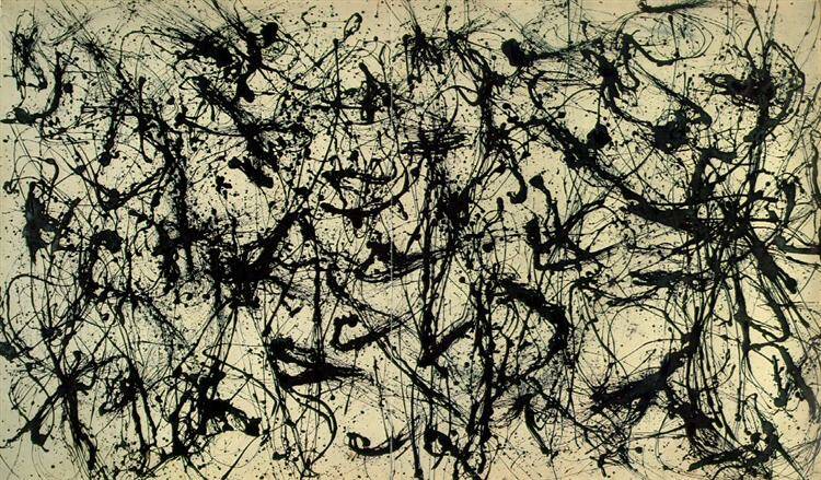
However, black and white can have also a strong, physical, powerful potential, especially in abstract art. Jackson Pollock's black pouring is an example of this tendency; this series appears as a more graphic synthesis compared to the master's famous colorful paintings but at the same time a black and white painting full of the same energy and action of yellow, red, or blue best-known artworks.
A Stance of Liberation
The reasons behind the choice of artists to reduce their color palette are varied, as are the effects they create.
However, leaving out for a while psychology and culture, the choice of black and white has a common trait: it catalyzes the attention on a precise subject, form, or concept; it is extremely accurate and realistic, despite being a grey monochrome representation of a fully colorful world. Above all, artistic expression and exploration of black and white or monochrome is an act of freedom. Freed from the constraints and the exuberance of colors, artists are free to experiment. Without colors, artists are untied to play with lights, shapes, textures, and symbols with a new, purified, vision.
If you enjoyed this article sign up for our newsletter to receive notification of Cinzia Franceschini's next article in her series exploring color symbolism in art and history.
|
Do You Love Your Art? We Love To Help You Light It UP! When you decorate in stark colors it's hard to find the perfect task lights (and yes, art lights are task lights, tasked with the thrill of lighting your art!) finished in your black, white, or zen, or monochromatic, or industrialist, or minimalist color scheme. We have art lights in a range of sizes and styles all finished in Black. We have the same styles but all finished in White. There is a wide range of pricing, whether black or white you will find several styles at low price points and several styles at mid and high price points. Here is a link to all of our art lighting finished in BLACK POWDER COAT FINISH - Here is a link to all of our art lighting finished in WHITE POWDER COAT FINISH - |
_________________________________________________________________________________________________
 Cinzia Franceschini is an Italian Art Historian specialized in History of Art Criticism, with a second degree in Communication and Sociology. She studied in Padua, Brussels, Turin and wherever you can go with the power of the Internet. She works as guide in Museum Education Departments and as a freelance writer. She writes about Contemporary Arts and Social Sciences, mostly about them at the same time, in an inclusive, feminist, transnational perspective.

.png)