- Home
- / Blog
- / Art History
The Genderless Force of Pink Color in Art
12/24/2021
There is no color more divisive and extreme than pink. You can love it madly, to the point of obsession, or hate it, judging it fussy and pretentious. Pink is a color that gets people talking. It has a cultural history full of meanings, even subversive, and which has in advertising marketing the precise mission of attracting a specific pool of consumers. The pink color in art history is never accidental.
This curious pigment has power in the market world: have you ever heard of the pink tax? It is not actually a tax, but a surcharge reserved for traditionally feminine products with eye-catching, pinkish packaging. Pink sells better, especially among women, and advertisers know it. This gender-based difference in pricing is unethical and unfair, but it reveals the particular social bias and symbolism behind this hue. All the colors in the color theory have culture-related meanings, as we demonstrated with black, red, yellow, blue, and purple. However, it's hard to find one with more intrinsic political meanings than the color pink. This is because pink in the Western conception is often arbitrarily associated with the female gender, with the related cultural changes and stereotypes that follow.

Pink, more than other shades in the color scheme, has a socially connoted history. But that was not always the norm. Pink acquired a feminine identity around 1950, before that date it was absolutely genderless. We can even think of a gender switch in ancient times: in the Renaissance, soft pink was more commonly associated with men, being a shade of purple and red, the color of courage; on the contrary, blue was the color of calm, of Madonna's virginal mantle, and therefore a more feminine color. In the post-World War II years, marketing radically reshaped the fate of this color, feminizing it. The strategy was functional to establish a clear division of female and male roles, also in terms of clothing, aesthetics, and, therefore, chromatics.
If men wore serious, formal colors, the perfect housewives of the 1950s could easily wear lighter and more carefree colors, which represented their alleged frivolous spirit. Soft pink was the ideal color to wear within the walls of the house. The association of blue and pink for babies came soon after, in the 1980s. Once again, it was the marketing that changed the course: the increasing use of fetal sex identification imposed a differentiation even in consumer goods, from baby clothes to birth ribbons, up to the Barbies.
But the color pink is so much more than a girlish color. It has broken free from the frilly and superficial aesthetic to which it was relegated in the 1950s. As did the women, taking this pigment with them in their tangible and symbolical struggles. Deployed in Women's Marches, by the gay activists of the 1970s, in the battle against breast cancer, pink changed its meaning, charging with force and power. It resemantized its identity, showing that it is not as soft and pale as many thought. Or rather, that it can be that and a million other things. Pink opposed the destiny that had been written for it.

Pink Garage, Photo by Jarrod Reed via Unsplash.
1. A Dive into Pink Art: Rococo Romance
Pink has always fascinated artists for its delicate or shocking shades. When Anish Kapoor imposed his provocative embargo on the black pigment he invented, Vantablack, the artist Stuart Semple retaliated with the ‘pinkest pink’ in the world. But the use of pink color in art is not only a prerogative of the 20th century, of contemporary artists, and their acrylic paint. In this article, we will explore 5 different approaches to pink color in art, to reveal its symbolic nuances.
Pink was truly loved by the nobility of the 18th century; in particular, it was perfectly suited to the whimsical and frivolous spirit of Rococo. The European bourgeoisie was enchanted by this color that soon dominated clothing, tableware, interiors. It was in particular Madame Pompadour, Louis XV’s official chief mistress, to make her favorite pink blush hue extremely fashionable among the aristocracy. Her bright pink pompadour became à la mode for porcelains and tableware, also becoming a symbol of wealth and glitz…without sacrificing a touch of lightness!
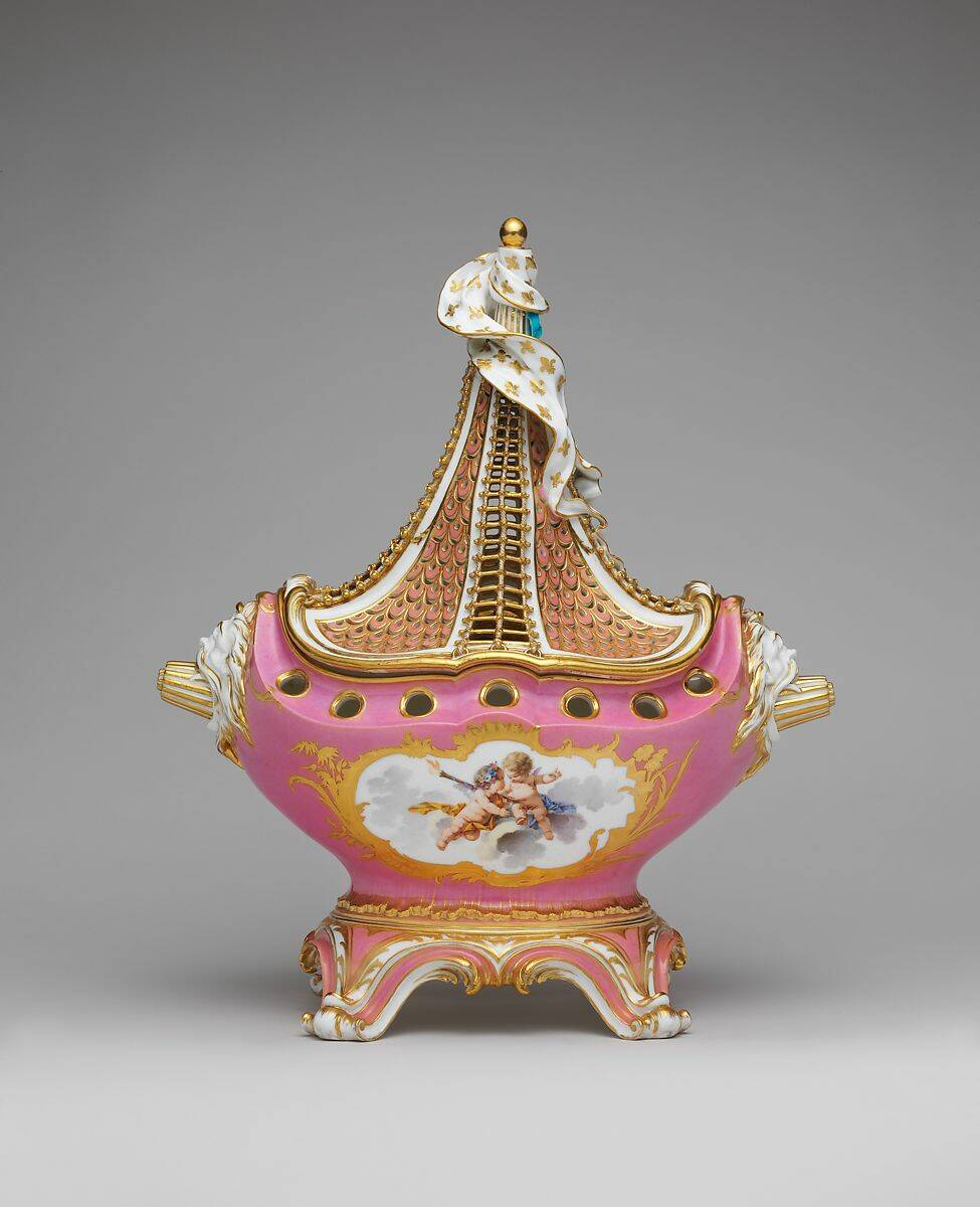
Pink perfectly embodied the romantic aesthetic of the 18th century and the ladies of that period. The noblewomen painted by French painters Jean-Antoine Watteau and Jean-Honoré Fragonard, for example, often wore opulent light pink dresses, even though the color was also in vogue among men. In the painting The Happy Accidents of the Swing a young woman in pink flirts with the man hidden behind her back, in front of herunaware husband. Pink is therefore tinged with flirtatious, playful, but also extremely ironic tints.

2. Tender and Melancholic Pink
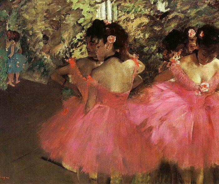
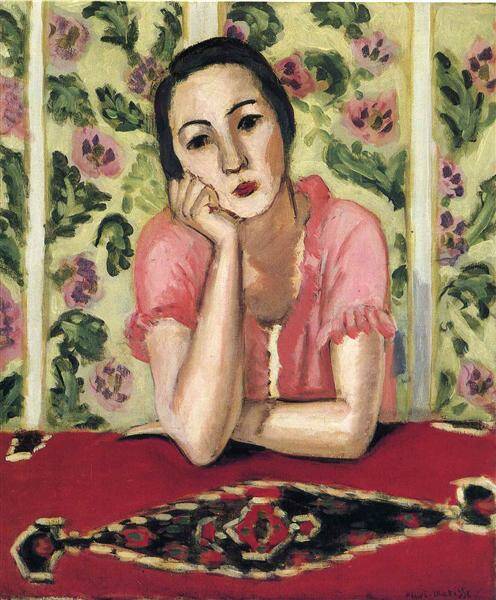
Pink has a different history from other pigments, which is also reflected in art and in habits of society. In the 19th century, for example, young boys used to wear pale pink in their clothing as well, as it was considered to have the color meaning of tenderness and innocence. Similarly, young women also wear the color for its grace. Painters such as Degas, have painted its elegance, associating it with the tutus of young ballerinas. Zandomeneghi and Matisse captured the feminine and melancholic side of pink, portraying no longer the sumptuous noble ladies of the 18th century, but young women of good families. Always in a pensive and absorbed attitude.

3. The Spiteful Attitude of Pink
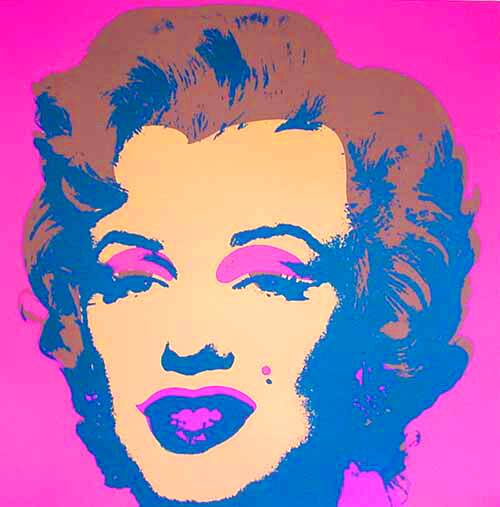
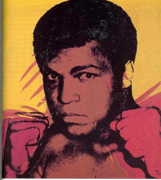
However, pink is not just about flowers and prettiness. The use of pink color in art came back to the forefront in the age of consumerism, especially with the Pop Art movement. Andy Warhol immediately caught the cheeky, acid, in some ways spiteful and critical side of this color, using it in many of his art prints. Pink is a candy color, which was perfectly suited to the celebrities whose portraits Warhol copied and pasted, denying the matrix of their originality and uniqueness. The artist, renamed by Financial Times as the ‘uncomfortable entertainer’ obsessively reproduced them in series. His pink Marylins -but also his pink Muhamadd Alì- are not too different from a glitterous packet of sweeties. To fastly love and consume.
Wikiart.
4. The Powerful Pink of Activists
The history of pink color is also laden with dramatic events. The Nazis used inverted pink triangles to identify what they considered to be 'sexual criminals'. Homosexuals, transsexuals, transgenders, and bisexuals were included in the Gestapo's pink lists. Pink then became a symbol of the monstrous discrimination, violence, and persecution suffered by the category in the concentration camps, exaggerating the gender connotations of a color that had previously been light-hearted. But as often happens in history, this tragic symbol has been revolutionarily overturned. Gay civil rights activists of the 1970s appropriated this color, turning it into a symbol of struggle against oppression and oppressors. The Sydney Gay and Lesbian Holocaust Memorial is a pink triangular prism that reminds us of the horrors the queer community suffered, but also their need for a safe space and freedom.

Sydney Gay and Lesbian Holocaust Memorial, via Wikimedia Commons.
5. The Color of a Rosy Future
Pink is therefore a color full of meanings, even strongly political. Often unjustly ridiculed by sexist mentality, it should be reclaimed and rehabilitated precisely for this reason. For decades, women have been pinkized by advertising and product design. The Korean photographer JeongMee Yoon in her series 'Pink and Blue Project' immortalized the sea of shocking pink plastic in which little girls are immersed from an early age, photographing them in their bedrooms. A grotesque phenomenon that makes you think.
Today, the color pink is no longer girls’ stuff. Some types of pink, such as the Baked-Miller pink, have even been studied by scientists for their cognitive properties. This particular shade was appreciated for its ability to reduce aggression and boost concentration. A calming effect that explains its application in hospitals, psychiatric institutions, and correctional facilities. Marketing has also continued to love pink, free from gender connotations or, in some cases, used precisely to simulate solidarity with the LGBTQ+ community and feminist issues, without actually contributing to the cause –a strategy called pinkwashing-,
In any case, pink is an evergreen trend, both in fashion and interior design, being able to capture attention outside and inside the Instagram feed. Millennial pink, in particular, is the light pink most loved by young consumers, as demonstrated by the sales of rose-gold iPhone and the success of Wes Anderson's pastel cinematography. Pantone proclaimed the rose quartz, a shade of blush pink, the color of 2016, considering it the best color to 'represent the current zeitgeist'. Pink could be the color of an era with the constant urge to calm anxieties and animated by powerful attempts of inclusivity, It could be the color of a rosy future. Colors are serious business. Written in pink.

______________________________________________________________________________________________________________________________________________ Cinzia Franceschini is an Italian Art Historian specialized in History of Art Criticism, with a second degree in Communication and Sociology. She studied in Padua, Brussels, Turin and wherever you can go with the power of the Internet. She works as guide in Museum Education Departments and as a freelance writer. She writes about Contemporary Arts and Social Sciences, mostly about them at the same time, in an inclusive, feminist, transnational perspective.


